I didn’t really do a great deal with colour for the most part. I colourised in Apple’s Color, which I find the easiest, most accessible and most advanced colour program available on a limited budget. Plus its compatibility with Final Cut is excellent, allowing you to put elements into colour, back into Final cut without having to worry about sound or effects put on in Final Cut. I added a basic contrast- deepening and darkening shadows, pulling down mid-tones and pushing up highlights. I also applied a mid-tone red wash to all of the outdoor shots to create a sunrise feel. I pulled down saturation to match the mood of the outdoor shots and also give a suggestion of oldness.
Simple contrast on this shot, which is the grade I applied to most of the outdoor scenes. De-saturated slightly and with a slightly red mid-tone.
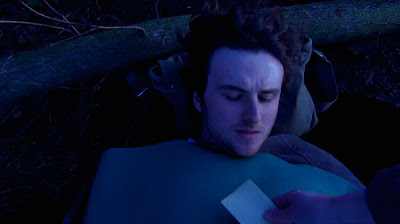
When Ernest is reading the letter it is supposed to be night-time, but as I shot the scene in broad daylight, I needed to do a bit of work on it. I applied my usual outdoor contrast grade, but then made the shadows a bluey/purple colour and the midtone a deep blue. I darkened the entire thing and made the shadows deeper, but also made the highlights less light than I usually would in order to try and make it look like night.


